Opacity is the term used to describe the hiding power of paint
There are three things that affect how opaque paint is, the type of pigment and its particle size, the makeup of the paint medium and the thickness/number of layers plus the base colour
Not all pigments are made equal
At the time of writing this post, The Color of Art Pigment Database lists 551 different pigments that can be used to create paints, all of them are different even if they are part of the same family but can be generalised into two types
Inorganic Pigments - These are natural, earth based pigments that have been used since humans first figured out how to use them and rose to prominence during the Renaissance period. They are usually dull, muted colours with a high opacity thanks to their large particles that scatter light very well giving them a high refraction index. Pigments such as Titanium White and Oxides fall into this category.
The INSTAR Alpha paints that fall into this category are
Pure White, Pure Oxide Red, Pure Oxide Yellow and Pure Brown
Organic Pigments - Developed in the 19th Century and still being developed today, Organic pigments are made in laboratories and make up the large majority of colours that we see today, however they have small particle sizes with a low refraction index, this makes each of the particles like a tiny stained glass window and are just as transparent. Pigments such as Phatalo Blue and Pyrrole Red fall into this category
The INSTAR Alpha paints that fall into this category are
Pure Blue, Pure Green, Pure Orange, Pure Yellow, Pure Mid Yellow, Pure Purple, Pure Black, Pure Magenta and Pure Red


The Art of the Medium

This is the most complex and complicated part of the whole process, put simply, there is no right or wrong answer as to how the paint medium should be.
Acrylic paint medium consists of three elements at its core, the plastic, the filler and the solvent.
All acrylic paint is made up of tiny particles of plastic and is the main component of any acrylic paint, but because it's transparent, it has a very low refraction index meaning that almost all light passes through it.
If you have a really matte paint, it's likely to contain a lot of filler, usually made up of Calcium Carbonate, rather than coloured pigment as it creates a more opaque paint given that it's an off white, large particle powder giving it tremendous light scattering capabilities, however the more that is added does increase the viscosity of the paint meaning that it needs to be watered down before it's usable as a paint for miniatures.
The final part is the solvent. Usually water is added to act as the carrier for the paint as every part of the paint mixture is insoluble and helps it to flow, the water is then modified with thickeners to help suspend the particles, in some cases turning it into a gel. Adding too much water though gives it a long drying time and too little means the paint dries too fast.
If the amount of water that can be added is limited, it can be adjusted by other additives to speed up or slow down the process, these additives however contribute to what's known as the VOC content or "Volatile Organic Compound" which affects air quality as it dries. They are common in all paint, but each paint has a different amount, Alpha has less than 0.01% by weight of VOCs meaning they are virtually VOC free
How it all fits together
So making a paint sounds like it's quite simple, add pigment to the paint medium and that's it.
While it may sound simple in principle, if you want a brilliant colour, you have to use an organic pigment, however adding inorganic pigments or fillers, while creating more opaque colours, lighten and desaturate colours. So to have a brilliant colour, these would need to be omitted, but this results in a translucent colour with poor coverage or if the paint contains a lot of filler, a very pastel, very pale colour.
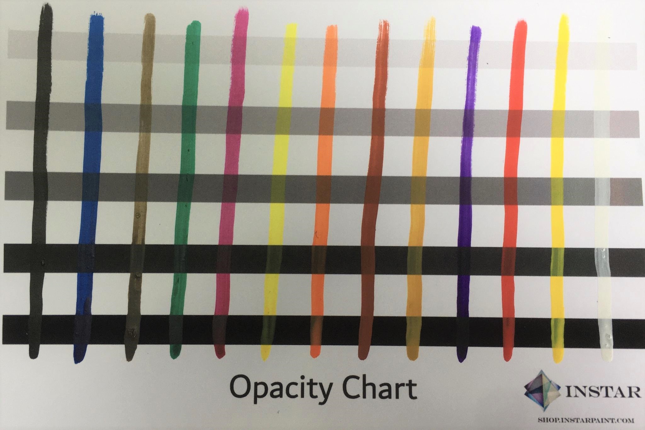
You may have seen in many internet forums on miniature painting about how to make colours like yellows and blues more opaque, one of the common misconceptions is that the pigment needs to be finely ground to give a better coverage, but if the pigment is already transparent, no amount of grinding or saturation will make the colour more opaque as these photos show


The Alpha Pure Magenta appears more opaque due to a higher refractive index thanks to the addition of other elements within the paint mixture, adding more of the Quinacridone Magenta pigment with its lower refractive index would make the paint more transparent
The drying time is also a factor, when you shake all the components of the paint together, you make an opaque paint. When you apply a layer of paint, the pigments begin to settle, the faster they dry the more the particles get locked in a combined state giving better light scattering.
But the colour will appear brighter, as more of the light will be hitting larger, more opaque pigments and passing through less of the transparent pigments
If they dry slower, the pigment has more time to separate as different pigments have different densities, inorganic pigments are more dense and sink causing lower density, organic pigments to rise resulting in deeper, richer colours.


It's all about that base (and layers too)
When using organic pigments, the base colour you use is extremely important, as mentioned in Part one, White surfaces reflect all light, Black surfaces absorb all light.
Bearing this in mind, you can now understand why yellow, red, blue and any other organic pigment has seemingly such poor coverage over black undercoats as shown in these diagrams.


As you can see, it's not that the paint has terrible coverage, just that the more light that is reflected back by the White layer, this makes the colour appear brighter and more brilliant as more of the light is reflected back through the transparent layer, however with successively darker base coats, more of the light is absorbed resulting in less of the colour showing from the lack of reflected light
This is where more layers come into effect, the more layers that are applied, then more of the initial light is reflected back with each successive layer


However, transparent, organic pigments will never be truly opaque due to their nature and are meant to be mixed with other pigments to create opacity, you can easily mix two organic pigments together to lighten colours without resorting to White, but it will still retain most of its transparency.
The undercoat or base layer becomes an important factor, but by being clever with your choice of colour, you can create the illusion of opacity.
We'll cover it more in a future article, but it has something to do with the Abney effect or our perception of hues. You may have heard of using pink to improve Yellow coverage, in short the trick works because pink it is the harmonious colour of Yellow, these are the colours that are two steps away from each other on the colour wheel.
"But you use Red to create pink and that's upto four steps away from Yellow", that is certainly true, but you can also make a pink using a very pale version of Orange which is only two steps away, either by painting Pure Orange over a white base layer or making a desaturated version using Pure Orange mixed with Pure White.
This undercoat colour give a warmth to the yellow, but the trick also works with a Pale Purple which is the complementary colour to Yellow, this undercoat gives a cold, golden look to the Yellow


So paints that don't cover well are not garbage after all?
Unless you are painting purely with muted, desaturated colours then no, it's all perfectly normal for more brilliant colours such as reds, yellows and blues to be more transparent than other colours. Even if you painted the same layer over a black or white undercoat, the layer's the same thickness, it's just the nature of the pigment.
If the colours cover better, it is usually because there will be an underlying, inorganic pigment that you're not aware of doing most of the legwork and this is where colour mixing comes into it's own as a science. You will find that small amounts of inorganic pigments can help organic pigments appear more opaque without sacrificing too much of the original colour.
All paint lines, with the exception of the Alpha range, are designed to be consistent in viscosity rather than colour because if you had a range that was too inconsistent with its viscosity, it would be very difficult to work with as some colours would have to be thinned where others would be too thin so some sacrifices have to be made to ensure that consistency is maintained.
Alpha was designed to eliminate that problem, all our colours have a similar level of transparency that you would expect when using a thinned paint and are all the same viscosity but retains enough grip to not flow into areas of a miniature you don't want it to go to, this means that layering paint and creating undertones becomes much easier and smoother. but because they were designed to be similar, mixing colours give you a more predictable outcome rather than playing a guessing game with ranges that promote pigment contents of varying levels.
Which brings me onto a final note of thinning paints to create more thin layers, using paint mediums should really be avoided unless you're specifically making a glaze.
Because the paint medium introduces more transparent particles to the paint solution, it actually makes organic pigment colours worse by introducing more transparency. Our Provectus Water+ product was designed to avoid this situation, by crosslinking the particles in the solution rather than adding more transparent particles, it keeps the paint locked together even though it has been thinned down. Then as it evaporates off, it brings the particles back together to create a more even layer.
With a paint medium, you're always going to be trying to push water uphill, you'll get there eventually....but you'll have used a lot of unnecessary effort to do it.
Part one - Colour Science | Part two - Characteristics of Colour Mixing | Part three - Explaining Opacity | Part four - Fluorescent paints unwrapped