

Ever bought a colour only to find that the swatch on the website doesn't match the colour you have?
Are the website designers just being lazy or is there something else happening?
You'll be happy to know that this has always been a problem with paint and digital representations and it's just a simple case of one colour type being Additive and one colour type being Subtractive. This was covered over in Chapter 1 where we gave a brief overview of both types. Additive colours relate to RGB and the colours you see on monitors and phone screens. Subtractive colours are what you see when you mix paint on a palette.
Additive Colours
Where it all began (1802 - 1860)
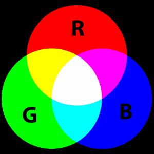
Additive colours or additive mixing is a colour model that attempts to predict the appearance of a colour by mixing Red, Green and Blue Lights. Mixing these in equal proportions reveals the secondary colours of Cyan, Magenta and Yellow and mixing all three together produces White light.
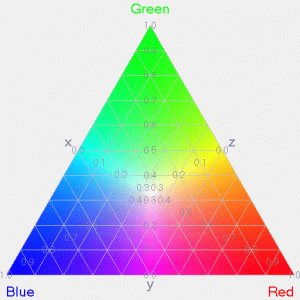
The Additive or RGB color model is based upon the Young-Helmholtz theory of trichromatic color vision (developed by Thomas Young and Hermann von Helmholtz in the early to mid nineteenth century) and also on James Clerk Maxwells colour triangle that elaborated on the theory.
In 1802, Thomas Young postulated that there were three types of photoreceptors in the eye. Each one was sensitive to a particular range of visible light. Helmholtz developed the theory further in 1850, that the three types of photoreceptors (known as cone cells) could be classified as violet, green and red according to the response of the wavelengths hitting the retina. The strengths of these signals detected by the cones were then interpreted by the brain as a visible colour.
In 1857, James Maxwell used Linear algebra (recently developed at the time), to prove their theory and develop the precursor to the CIE 1931 colour space, that would eventually lead to colour matching functions.
It wasn't until 1956 when Gunnar Svaetichin would prove the existence of the cone cells and took another twenty seven years for the theory to be validated in 1983 with an experiment by Dartnall, Bowmaker and Mollon, who obtained microspectrophotopic readings of single eye cone cells.
Photography (1861-1960)
Maxwell determined that each cell by itself did not see colour, it was just stimulated to various levels. With this he drew an analogy to black and white photography.
If three photographs were taken that were colourless, but each was taken through a red, green and blue filter, and the resulting transparent slides were superimposed onto a screen, the final image would not only contain the colours Red, Green and Blue, but all of the colours in the original scene.
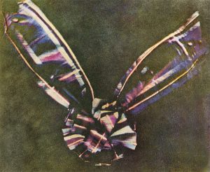
Thomas Sutton in 1861, took Maxwells idea and made three monochrome "Colour seperation" plates. The test subject was a bow made of ribbon with stripes of various colours, and by combining the three resulting images, produced the worlds first colour photograph.
This method continued to be used right up to 1960 when more modern methods for capturing colour photos became more time and cost effective.
The Modern Computing Era and Digital imaging (1960 - Now)
The 1960s saw purposely coded imaging starting to take place. In 1961 the first "Video Game" Spacewar was written and around the same time at the University of Cambridge, Elizabeth Waldram was writing code to display radio-astronomy maps on Cathode ray tube (CRT) displays. In the 1970s, practical computer graphics technology took a huge leap with the emergence of metal-oxide-semiconductor large-scale integration.
Further developments to this technology eventually gave way to the first Standard Definition Raster Graphics image which lead Xerox PARC to develop SuperPaint, the first computer graphics system in 1972.
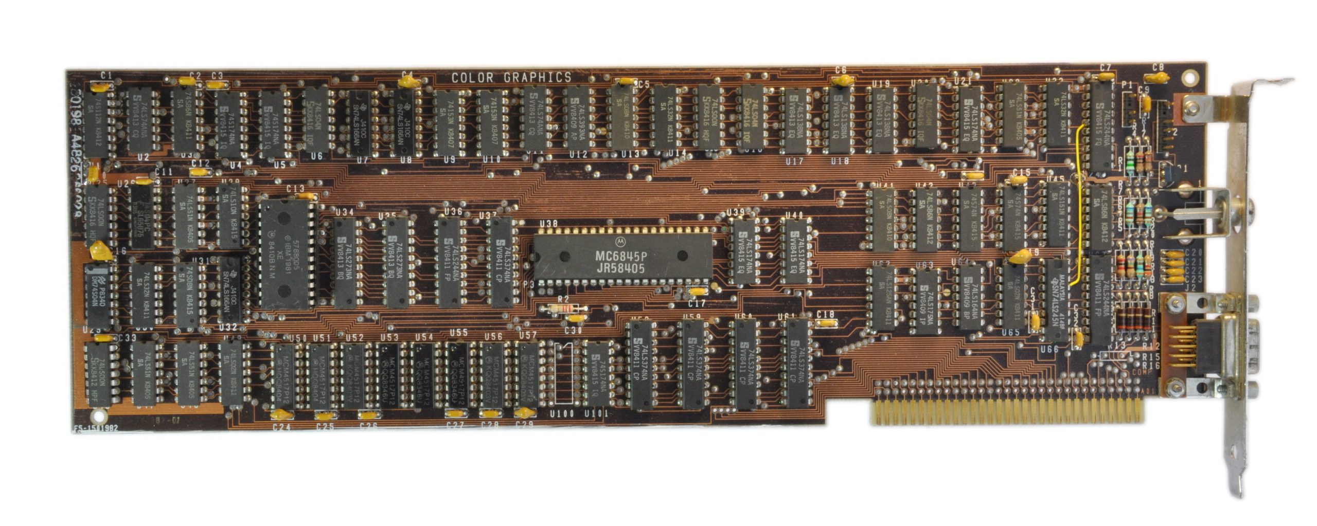
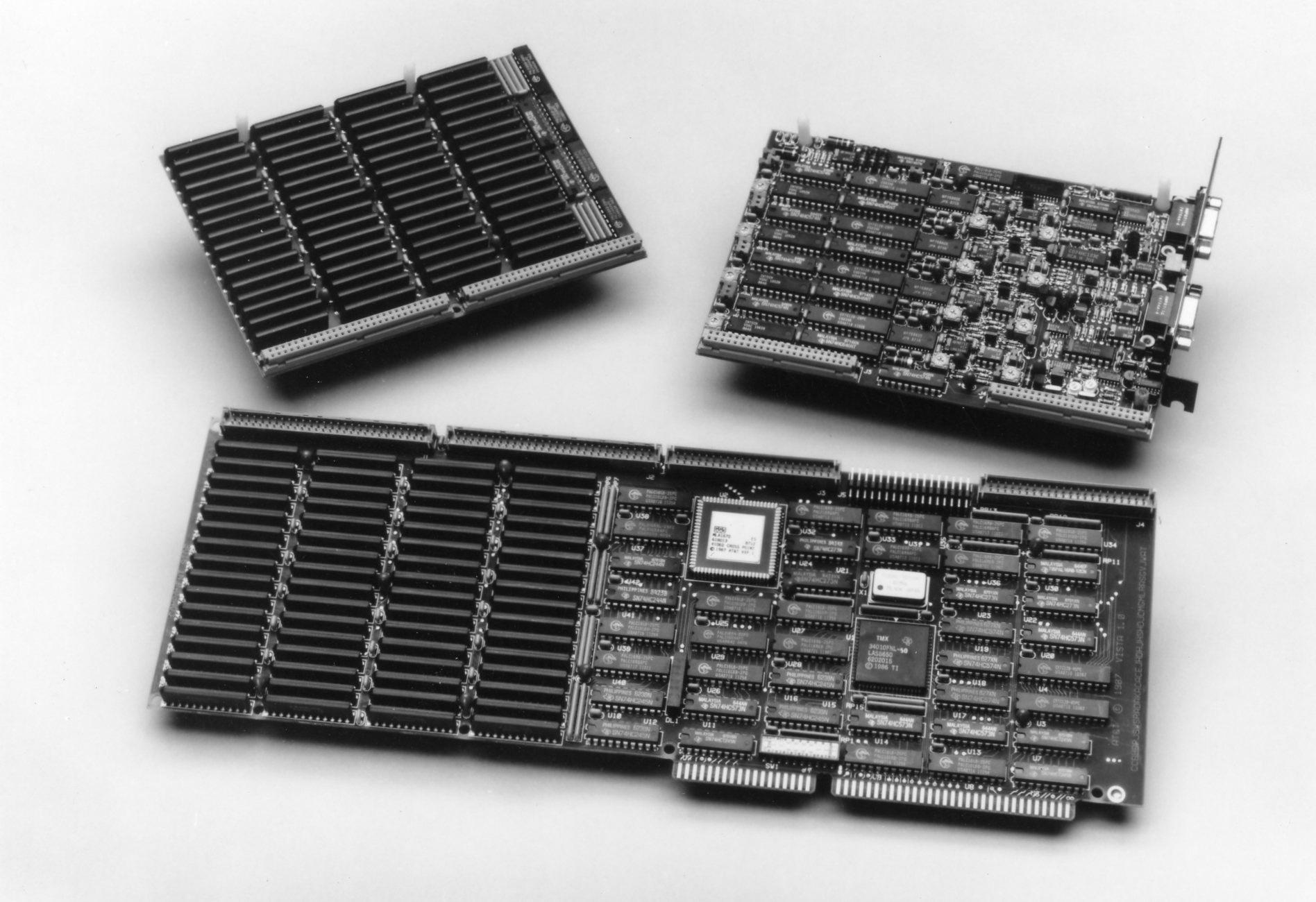
The first manufacturer of a Truecolor graphics card (or TARGA) was by Truevision in 1987 and while RGB had been used since 1981 by IBM with its Color Graphics adapter (CGA), that used four bits per colour (red, blue, green and intensity) and then later their Enhanced Graphics Adapter (EGA) in 1984, they didn't have the colour depth required for realistic imaging.
It wasn't until the arrival of the Video Graphics array or VGA in 1987, soon after the TARGA card, that realistic images could be displayed on a screen as it allowed for a much wider range of RGB colours. However the original VGA cards were still palette driven, and it wasn't until 1992 when Super VGA cards gave the world truecolor imaging by providing a colour palette of 16,777,216 colours.
Further developments over the years continue to refine the technology.
Subtractive Colours
The subtractive colour model predicts the resultant spectral power distribution of light that is filtered through overlaid, partially absorbing materials on a reflecting or transparent surface. Each layer partially absorbs some wavelengths from light while letting others pass through resulting in a colour.
The resultant spectral power distribution is predicted by sequentially taking the product of the spectral power distributions of the incoming light and transmissivity at each filter.
The RYB model
This was the original standard set of subtractive primary colours used for mixing pigments and predated modern scientific colour theory.
The first known instance of the RYB triad can be found all the way back to 1567 in the works of Francicus Aguilonius, though at the time the colour wheel did not exist nor had it even been conceived. It wasn't for another hundred years after Francicus Aguilonius's death that the RYB triad was used in printing by Jacob Christoph Le Blon.
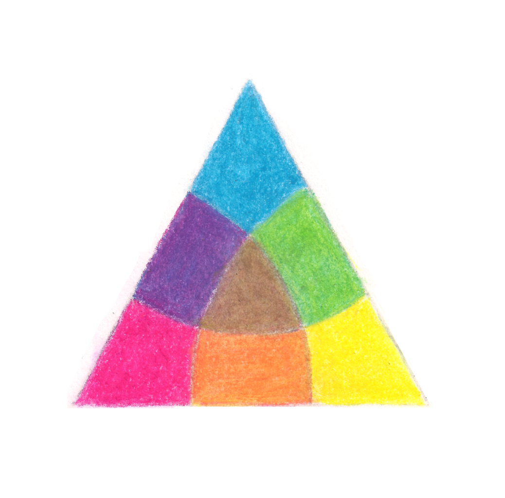
Le Blon asserted in his work ('Coloritto' or 'The Harmony of Colour') in 1725, that you can represent all visible objects in painting by mixing just three colours: Yellow, Red and Blue. He added that Red and Yellow makes Orange, Red and Blue makes Purple and Blue and Yellow makes Green.
In 1776, Moses Harris created the first 'Prismatic' colour wheel based off Isaac Newtons original colour theory. Harris referred to the colours Red, Yellow and Blue as "Primitives" and used them to create 660 distinctly unique colours. He also suggested that a mixture of opposing colours would create "a dirty unmeaning colour" and that a mixture of all three colours "in equal force and in the strongest powers which by violently opposing each other and in very unequal contest are all three continually defeated, causing a total confusion and obscurity in darkness", suggesting that these three colours create black. In reality though, the RYB model produces colours that are more Grey or Muddy.
The CMY model
This RGB model has been largely pushed aside for the more versatile CMY (Cyan, Magenta, Yellow) triad with Cyan being referred to as "Process Cyan" and Magenta as "Process Red". Though what actually constitutes these colours is still up for debate, for example some "Process Cyan" pigments can be either too overpowering or too weak.
While the CMY model is usually reserved for printing, it does allow for the same principles to be applied to paint as well. Cyan acts as a filter that absorbs red light. The amount of Cyan that is added to White paper determines how much red light is reflected back. With paint, the Cyan colour helps to make deeper, richer purples thanks to its ability to absorb red light. The same debate applies to paint pigments as well, currently there's no "standard" as to what the Cyan, Magenta and Yellow pigments should be.
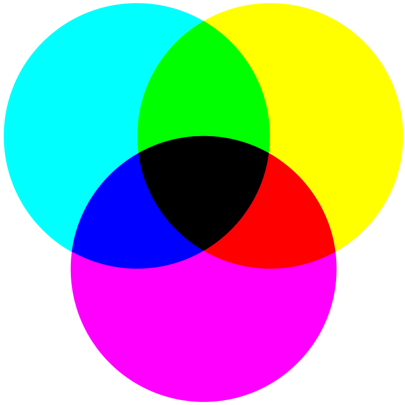
When the Primary colours are mixed in equal proportions, their secondary counterparts are created: Magenta and Yellow create Red, Yellow and Cyan make Green, Cyan and Magenta make Blues and Purples.
Mixing these secondary colours with their complementary or opposite Primary colour creates a darker version of the Primary colour: Cyan and Red makes a Very dark Cyan or Teal, Magenta and Green results in a very dark Magenta or Purple, Yellow and Blue results in a very dark yellow or dark olive colour.
The difference between printing pigments and paint pigments is what happens when all three colours are combined. In printing, the resulting colour is a near Black due to the transparent nature of the pigments (In CMYK printing, Black is introduced as K to help produce Black and darker tones). In painting, this can be different depending on the pigments used, in some cases you may get black, in others a very deep teal colour or a Green-Brown colour.
So what does all this mean?
Put simply the two systems are opposite ends of the spectrum, one is absolute, the other is a sheer guess.
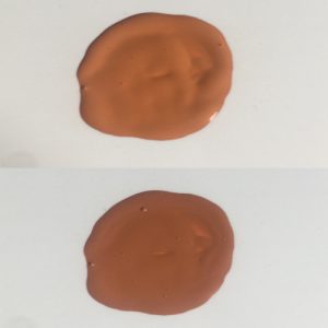
The RGB method used for monitors and other digital devices utilises the same coding structure regardless of the graphics manufacturer and what device you view it upon. You can prove this by saving the swatch image to the right into any paint program and use the dropper tool, or a free program such as Plastique PixelPicker to get its RGB numbers which will be R:88, G:91, B:100.
You might recognise this swatch though from the very start of this piece and it does hold some significance because the other swatch that was with it is the same colour, but with the colour codes taken from a retail colour scanner.
And here is where the issues begin.
The swatches you're looking at are from a mix of our Pure Black and Pure White in a ratio of 1 part Black and 5 parts White. The first swatch that we mentioned is what the program we use thinks will be the resulting colour based upon an equation that looks at its spectral signature. But because it needs to translate this into an RGB code so that a monitor will display it correctly it's a bit off compared to what you see in reality but arguably, it's as close as it can be when trying to get two incompatible systems to talk to each other. While one system is trying to absorb light (Subtractive) the other is trying to recreate it by adding light (Additive).
This also applies in the same way with the retail scanner, this gives a reading of R:81, G:88, B:96, which is darker than what the equation comes up with and also what we see in reality. Retail scanners are meant to replicate what the human eye sees, but they are also subject to the same equations that our system is based on.
Most of these scanners don't account for gloss, swatch thickness, smoothness etc so will give a different reading unless all the conditions are absolutely perfect, unlike the equations our system utilises.

What the equation thinks it should be

What the colour scanner thinks it should be
So does this mean that all digital swatches are wrong?
Yes and no......
Ultimately it's all dependent on the paint manufacturer and the type of equations and scanners they use for determining what the paint colour should be when reproduced digitally. There's also the finishes and the actual recipe of the paint to take into account as well that can affect the final reading.
These variables mean that what you see on screen can result in something different to what you see in reality.
One of the best places you can see this is when you print an on-screen colour to a printer, because the printer needs to adjust the RGB additive code to a CMYK subtractive code, there is a significant loss of colour information meaning that really vivid colours can seem dull by comparison, Greens are a great example of this as shown by this RGB representation of Acid Green and what Serif Affinity Designer and Adobe Photoshop suggests what the CMYK representation would be of the same colour.


It's also worth noting as well that the colour you see in a paint bottle (With the exception of INSTAR Alpha) is not representative of what the final colour will be and this final colour is what all paint swatches are based off. When a bottle is shaken up, all the constituents that make up the colour are jumbled up giving it really good light scattering capabilities and making the colour appear bright and vivid. But this is because of the larger, opaque, white and off white particles reflecting the light that's passing through the more transparent, smaller coloured particles and all these pigments and particles are mixed in near enough equal proportions.
Once the paint is applied to a surface and allowed to dry though, the differing weights of these particles will begin to settle with larger, heavier pigments settling nearer to the applied surface and the smaller, lighter pigments rising up above them.
This has the effect of making colours look darker than they look in the bottle, but all the same pigments are there. White is a very bright reflective colour while all other colours are darker in comparison and it's these colours that light has to pass through before reaching the reflective white layer, with less coloured layers the colour would appear brighter, but more desaturated and pastel thanks to the effect of the white layer.
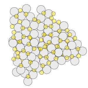
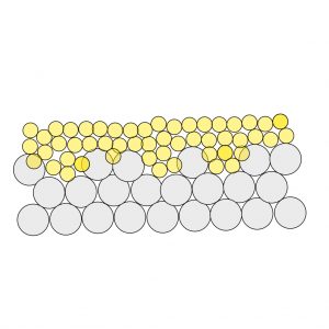
A great example of this entire piece is Jokaero Orange from Citadel Colour. In the pot it's a really nice pastel orange/red colour, once it's applied though the colour goes much darker and not at all representative of the the colour you see in the pot. But there doesn't seem to be a solid agreement on what the colour should be.





So what's the best way to ensure accuracy if you can't fully rely on digital representations?
The only way to ensure total accuracy of the paints you use is to create a swatch chart and physically paint a swatch that you can use as a reference, there are a couple of advantages to this.
- You can see the colour for what it is once it's dried rather than rely on the colour in the bottle which gives you a false reading
- You can see what the colour will look like under different lighting conditions, If you know what the lighting setup is like, you can use that to your advantage but also being aware that different light temperatures (or K) will affect the colours too
You can utilise our printable swatch cards for this purpose, while they were designed to keep a record of your colour mixes, it can work equally well in this regard too and ensure that you have an accurate record of the paints in your collection.
Part one - Colour Science | Part two - Characteristics of Colour Mixing | Part three - Explaining Opacity | Part four - Fluorescent paints unwrapped | Part five - Digital Swatches and Reality