Colour mixing is based upon a three dimensional construct compared to colour theory which works upon a two dimensional construct, An important distinction and one that is largely ignored
Colour theory has been extensively covered by many people across the internet and is a relatively simple concept, but the field of colour mixing remains largely untouched and the thought of it for some people is enough to put them off.
It is however extremely rewarding when you start to understand how it all works and isn't nearly as complicated as it seems.
But before we delve into it, there are a few things that need to be covered first and these are the terms Hue, Chroma and Value
Hue
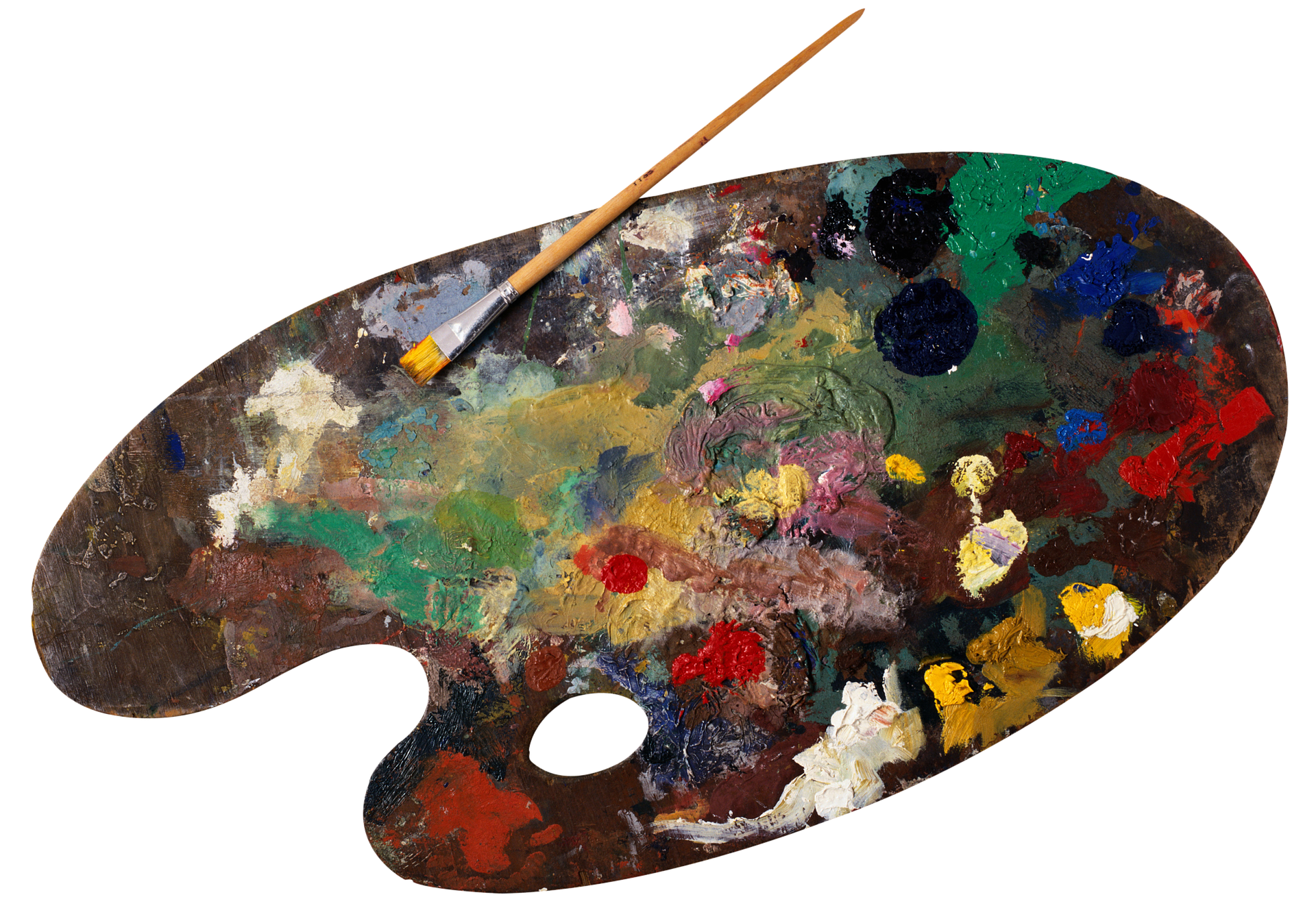
Hue is the technical term for the more common term of Colour, usually when people tell you what colour they can see, they are actually referring to one or more of the infinite number of hues that can be created.
It's the basic first step in colour mixing and theory, from a simple, warm red to a brown looking blue with a hint of red, everything our eyes can perceive is classed as a Hue.
On a colour wheel, for simplicities sake, the colour of Orange would encompass every possible hue of Orange that lies between red and yellow from Peach to Carrots to Skin
Chroma
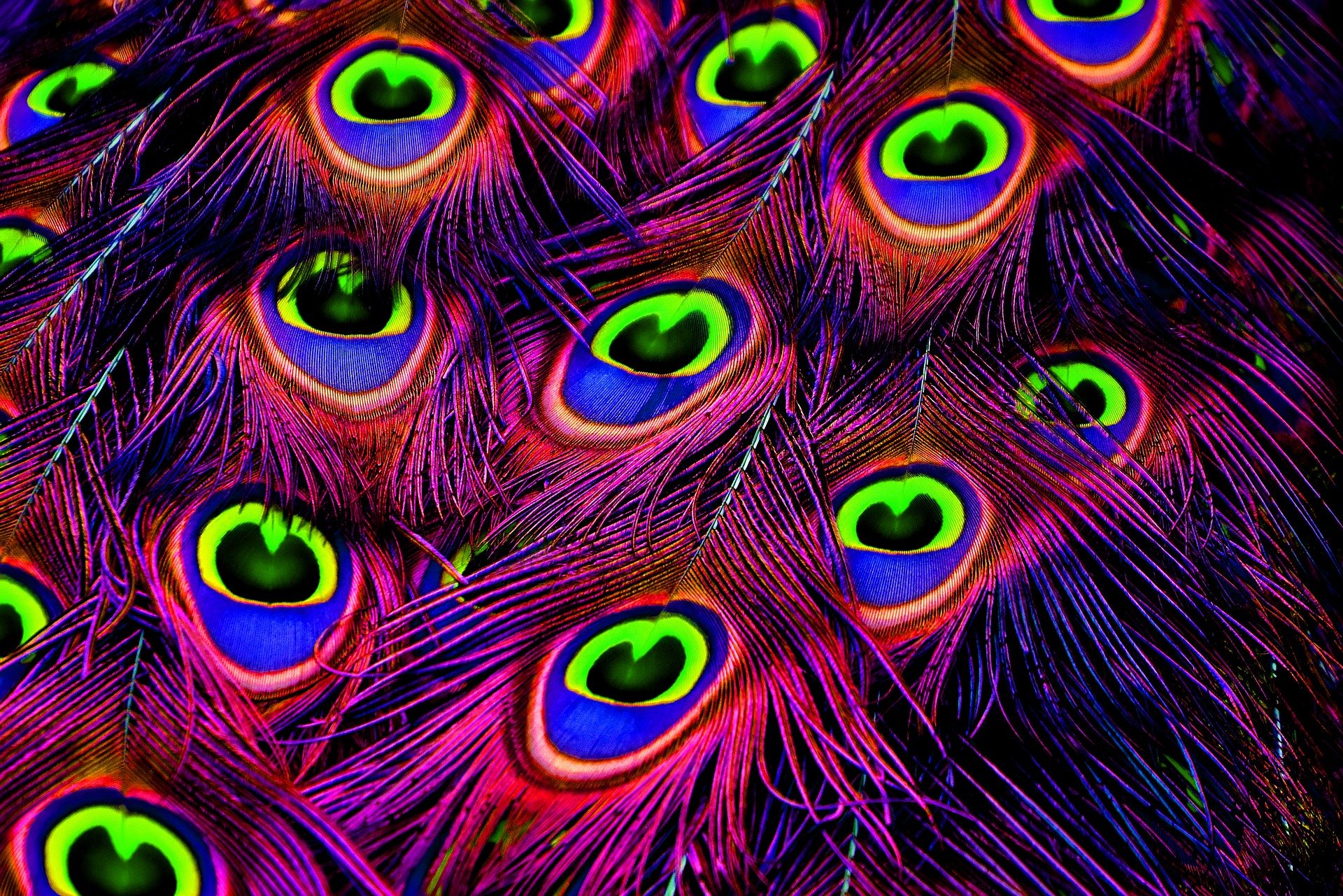
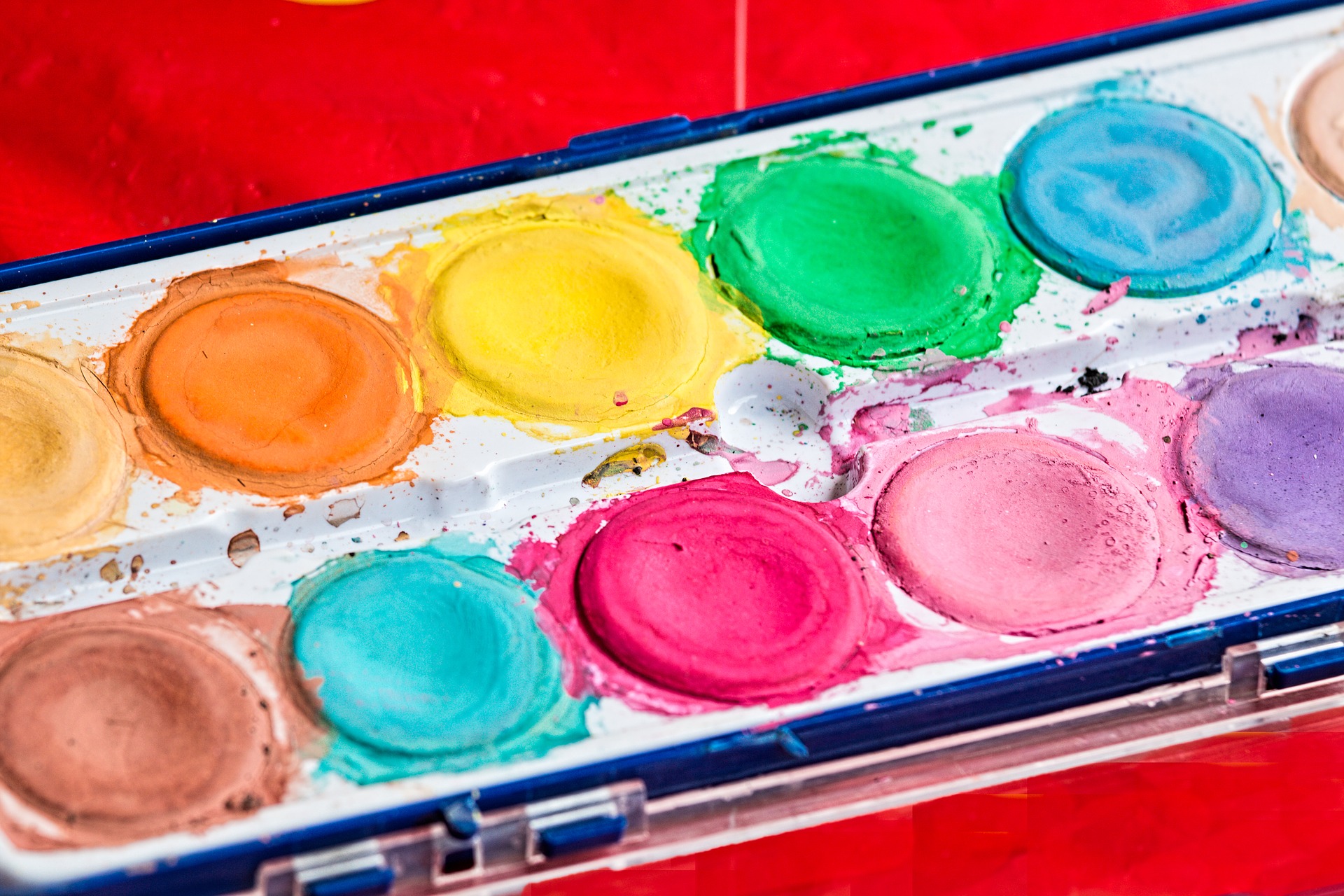
When people talk about the "Chroma" of a colour, they can be talking about one of two things, they are either referring to the purity and intensity of the colour or how saturated it is, but both terms are independent of each other as they both have a different meaning.
The "Pure" colours in the Alpha range, with the exceptions of the Oxides and White, such as Pure Green and Pure Magenta have a high Chroma value. What this means is that the colours are rich, full and have really high tinting properties with a poor hiding power or a higher transparency.
Colours like Pure Oxide Red appear duller or pale in comparison and are classed as having a low Chroma value, they have a lower tinting strength which means that they don't adjust colours as readily, but have superior hiding power making them great for adding body to colours.
If you've ever wondered why a Yellow sometimes covers really well, it's likely to have had a low chroma Pure Oxide Yellow mixed with a high chroma Pure Yellow pigment. This leads nicely onto the term Saturation.
Saturation is a secondary term that sits alongside Chroma. If you looked at a colour wheel, fully saturated colours sit on the outer edge of the wheel while fully desaturated colours sit at the centre.
The "Chroma" of the colour means very little here, Saturation just means is just how much of the primary hue there is, the moment you mix in a secondary or tertiary hue, the Saturation reduces accordingly.
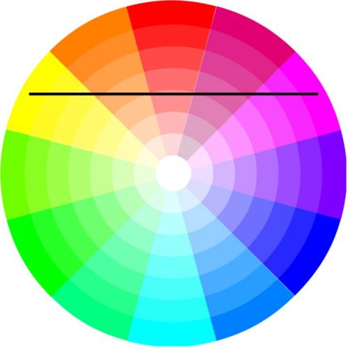
Mixing Pure Magenta with Pure Yellow results in a lower saturated Magenta, a more desaturated Red-Magenta and an almost fully desaturated Red, with the inverse of Yellow and Orange going the other way
But both terms are needed to understand what happens when you start mixing colours together. As with the example of yellow earlier, To make a better covering yellow, you need to add more of a low Chroma colour to give the colour more opacity, but this lowers the Saturation of the higher Chroma, more transparent colour which reduces its Chroma value as this drawdown card shows
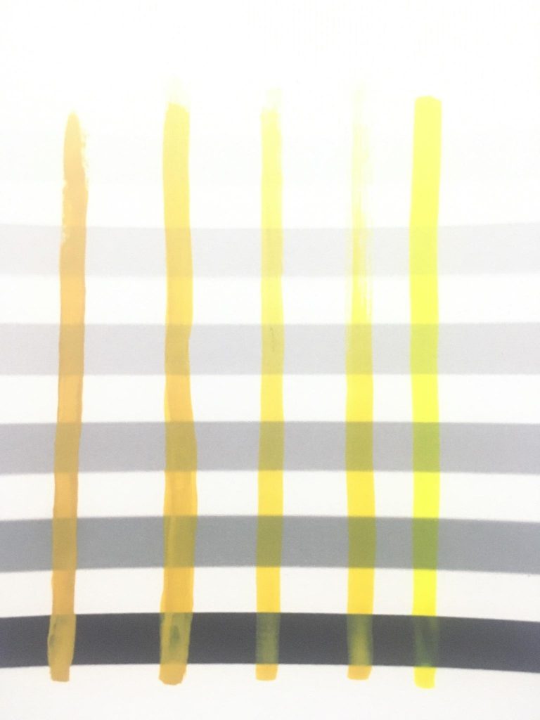
Pure Oxide Yellow is a Low Chroma colour, Pure Mid Yellow is a High Chroma colour.
From Left to Right : Pure Oxide Yellow (100%) - Low Chroma, Full Saturation | Pure Oxide Yellow (66%) : Pure Mid Yellow (33%) | Pure Oxide Yellow (50%) : Pure Mid Yellow (50%) | Pure Oxide Yellow (33%) : Pure Mid Yellow (66%) | Pure Mid Yellow (100%) - High Chroma, Full Saturation
Value
The first two parts deal with colour in two dimensions, Hues move around the colour space, Chromas/Saturations move forwards and backwards, but to truly colour mix, you need to introduce a third dimension which moves up and down and this is the Value.
While the Hue and Chroma will allow you mix a wide variety of colours, Value determines the final shade of the colour, in the miniature painting world, this would translate to three areas, Shadow, Midtone and Highlight.
Adding Pure White moves the value up and over from the two dimensional plane of Hue and Chroma and Pure Black moves the value down and under. This is best visualised as a sphere as Philipp Otto Runge’s Colour Sphere (1810) shows.
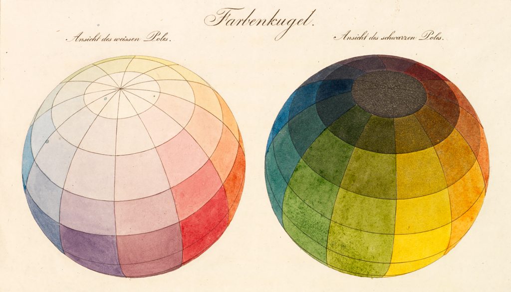
Value in colour mixing from a modern perspective is generally how much Grey you add to a colour and this also includes White. For simplicities sake, Value usually goes in ten steps from Pure Black to Pure White and all the shades of Grey in between (as shown in our Formula Mixing Recipes 1-11), but as with two dimensional colour mixing, you can mix any shade of Grey you want, even all the way past fifty.
In simple terms the more White you add, the brighter the colour and the more Pure Black you add the darker the colour, but the more desaturated it becomes, this is because the Value column sits in the centre and pulls the final colour in when it's used
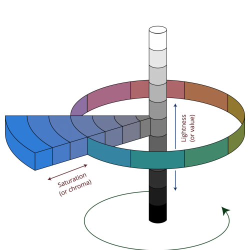
In the example above, the fully saturated colour sits on the very outer edge of the main wheel at Value level 5 which is normally where we perceive colours when we view a colour wheel. However, the very moment that we add the Value colour, the wheel begins to shrink.
This makes it subsequently easier to add or adjust any hues to the final colour as the smaller the circle, the less effort is needed to shift the hue. Much like trying to ride a bike in a circle, if you do long, slow turns, it's takes longer to reach your destination, but if you try to make smaller, tighter turns, it takes much less time to reach your destination
If you've made it this far, well done and thank you!
It might be a bit of a head scratcher but in the world of colour mixing you would take these three terms to make a colour in the following order - Hue, Value and Chroma
First off you would start with the Hue to determine what the base of your colour will be, whether that's a solid red or a mix of Yellow and Green.
Then you would then work out the Value of the colour taking into account that adding Pure White, Pure Black or a mixture of the two will move your final colour inwards as well as up or down the value scale.
This is why the Value step is second, because Pure White and Pure Black, being fully saturated colours, can create fantastic chromatically dark colours or bright pastel colours easily, but by combining them as Grey hue you can determine the final brightness of the colour.
These two colours alone are the most powerful colours you will ever own in colour mixing set that should be used sparingly and with a certain amount of respect
As our Mixing Swatch cards show below, While Pure White takes at least 10 steps to fully desaturate a colour to the centre and top of the mixing sphere, Pure Black can very quickly take it the other way
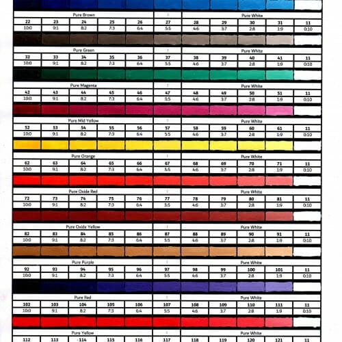
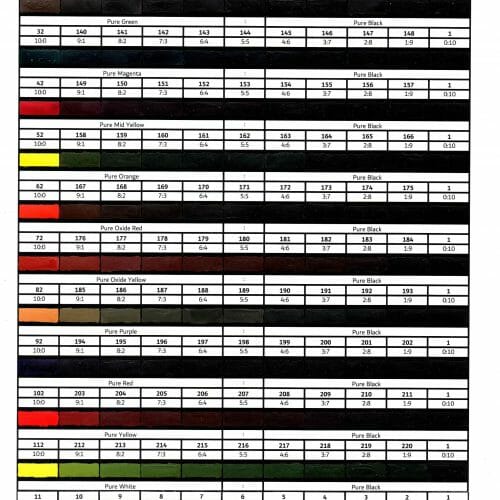
Then finally you would decide on it's Chroma, do you want it to have bright, bold colours by moving towards the outer edge of the wheel by adding the original hue back in or muted, softer colours by moving inwards by adding a colour on the opposite side of the colour wheel?
By visualising the movement of your colour while mixing around and inside a sphere, you can find it easier to figure out how to make the colours you want and not end up with a large amount of brown colours
Sections
Part one - Colour Science | Part two - Characteristics of Colour Mixing | Part three - Explaining Opacity | Part four - Fluorescent paints unwrapped