From observations made over the years within community chatter on social media and forums, it seems that there is some confusion as to what pigments actually do , what their role is in paint and things they can't do. We'll be lifting the lid on the wonderful world of pigments and hopefully help you understand them a bit more.
What exactly is a pigment?
Definition of a Pigment
A pigment is described as a material that is almost or completely insoluble in water. Pigments can be either Organic (i.e containing Carbon) or Inorganic (i.e Synthetic or earth based).
Inorganic pigments are generally brighter and longer lasting than organic pigments as they are not subject to the same stresses that organic pigments suffer from UV exposure. While organic pigments made from natural sources have been used for centuries, most pigments today are now derived from inorganic sources as mass production of these pigments keeps the cost down and are made with simple chemical reactions, usually oxidation, or found as earths. Iron creates Ochres, Siennas and Umbers that cover the range of Yellow, Orange and Brown. Certain compounds of Chromium provide oranges and greens (Which is one reason why emeralds are green...)
Organic pigments on the other hand are presently synthesized from aromatic hydrocarbons and incorporate an element within their system to provide colour. Nitrogen for example accounts for the vast majority of organic red, orange and yellow pigments while Copper accounts for really strong blues and greens.
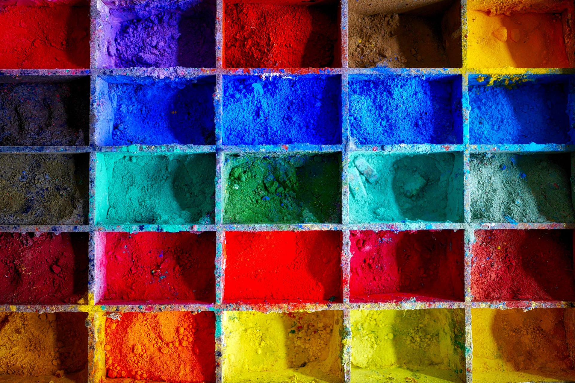
Digging Deeper...
The term "Pigment" however is a bit of a catch all term in the world of paint and it covers other materials that wouldn't necessarily be considered "Pigments" from a colour perspective. These include Aluminium Flake (Found in our Metal+ product), Pearlescent pigments (Found in our Spectrum product) and Mica crystals that are usually employed in metallic paints. However it's not just creating colour and effects that are the only things a pigment can do, they can also be made as "Functional pigments" that can offer abilities such as corrosion and mildew control and even as information storage for audio and video tapes.
The term "Pigment" also covers filler materials that can enhance paint properties while reducing their cost. However they have no effect on the colour properties of a paint and affect how glossy the finish is. If too much is added, the paint can dry to an undesirable, powdery finish. While these extra "pigments" are important to note, for the purpose of this article we're just focusing on what colour and filler pigments do in paint.
The colour in paint arises from the fact that colour pigments absorb certain wavelengths of light. To keep it simple, we'll look in terms of Red, Green and Blue.
Blue pigments absorb nearly all Red and Green light and reflect almost all Blue light.
Green pigments absorb nearly all Red and Blue light and reflect almost all Green light.
Red pigments absorb nearly all Blue and Green light and reflect almost all Red light.
The exceptions to this rule are White and Black pigments as these pigment are at the extreme ends of what they do with light. They are still classed as colours though with White pigments reflecting almost all light and Black pigments absorbing almost all light.
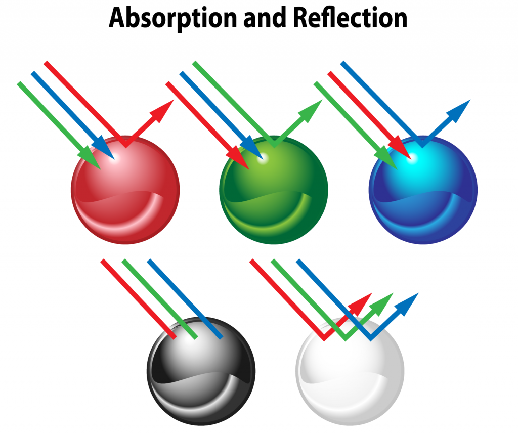
This is why colour mixing works the way it does. By adding the opposite pigment on a colour wheel, you effectively absorb the colour that the original pigment was reflecting back. This is why adding Red to Green and vice versa results in either a Brown, Grey or Off Black colour. We like to call it a "Black Hole" effect, in that the more of the opposite pigment you add, the more wavelengths of coloured light gets pulled into and locked into the paint mixture.
Does size really matter?
"Pigments have to be finely ground to obtain coverage and opacity"
This is a comment we have come across on social media and forums on more than one occasion and unfortunately the whole statement is incorrect, not just in the fact that things can only be made as small as they want to go, but more in the fact that some pigments are naturally transparent full stop, but we'll come back to that part in a bit. For now we'll dive into the different sizes of pigments.
The list on the right is taken from Handprint.com that handily listed pigments sourced from the following books - Handbook of Industrial Chemistry (1999); Gettens & Stout, Painting Materials (1956); Artists' Pigments (1996-2005); Kremer Pigments; manufacturer data.
They're approximate sizes based on an average distribution of pigment grades. However they do point out that pigments tend to clump into aggregates or agglomerates. In layman's terms that simply means that pigments have a natural tendency to be attracted to each other and form larger lumps than otherwise listed on the right.
Unless these are broken up sufficiently prior to usage means that you could effectively end up with a larger than expected particle of pigment creating the "splitting pigment" effect. This explains why vortex mixers produce smoother, better covering paint. It's not because it's mixed better, but all those lumps are shaken so much that they break up, an agitator just improves this even more.
It is also why thinning paint produces better layers of paint as the pigment is broken up by the thinning medium though this does create a double edged sword as we'll explian later. The term "Splitting pigment" is just a sign that the thinning medium you're using isn't sufficient in breaking up pigment clumps, it's also something that normal water is not very good at being a weak solvent.
This is why our Water+ product is fantastic at doing what it does with any paint range because of the ingredient inside it that helps break up pigment and polymer easier and more evenly, holding it in little, individual pockets in a crosslinked solution giving a smooth application with little fuss as it dries.
The size of the pigment is dependent upon its atomic structure, the more complex it is, the harder is it to make it smaller. If you remember from high school chemistry, everything tries to find balance, once that is found, a stable structure is formed. The crushing part of pigments is just to ensure that there are no large "boulders" as mentioned earlier, you simply cannot make something smaller or finer if it is already at the smallest size it can be.
In relation to the words "coverage and opacity", these are two sides of the same coin, but it depends on what it is that is trying to be conveyed as they can have different meanings.
Surface Coating Technology Handbook has a comprehensive section in Chapter 5 on inorganic pigments, though the same fundamentals can be transferred to Organic pigments as well. Opacity relies on the Refractive Index (or RI) of a pigment and the medium it is contained in.
In simple terms, RI is how much light is reflected back by a surface. Pigments are constants and the Medium is variable due to the extra additions that are put into them. As a rule of thumb, the larger the RI difference of the Pigment compared to the Medium, the more opaque, from a refractive standpoint, a coating is.
Iron Blue pigment or Prussian Blue for example has an RI of 1.56, if the medium has an RI of 1.5 (which is usually the average for an acrylic medium), then the paint will be largely transparent as very little light will be reflected back by the pigment. Red Iron Oxide, having an RI of anywhere between 2.8 and 3.1, would appear to be more opaque in the same medium as it reflects and scatters more light back.
Always wondered why yellows (with the exception of our Pure Yellow) tend to not have great coverage, there's the reason why.
However.....
Some pigments are transparent, period....
No, you didn't read that wrong.
Colours such as Magenta and Blues made synthetically are like tiny pieces of stained glass. But even highly opaque pigments such as Titanium White are translucent in a refractive acrylic medium, so how is it then some paints cover better than others if the pigments are translucent?
If you remember earlier, "pigment" covers an awful lot of materials, but it's these extra, notably the filler "pigments" such as cheaper Calcium Carbonate, that provide the Coverage not the Opacity. They are designed to fill in the gaps left by the pigment and surround it with material of a higher refractive index than the medium it is suspended in to provide something for light to scatter throughout the solution creating the illusion that the paint contains more colour than it actually does. As was previously stated, Filler "pigments" do not affect the overall colour of the pigment (unless it is white by nature), just the gloss. When these pigments are added however, it is done at a cost of the colour pigments as will be discussed later.
Opacity or Hiding power is determined by the concentration of particles in each layer of paint. If you took a powdered pigment and put it in a glass container, it would appear totally opaque as the light is scattering off the high concentration of pigment. However if you added water to the pigment, it would become translucent as the light is not scattered as well off the pigment. This is the effect you see when you usually apply a single layer of paint to a surface when it doesn't contain any filler pigments.
This is how the vast majority of higher quality artist grade paints work when using single pigments, they are all relatively translucent by nature as they don't contain any filler pigments and rely on the power of layering to create opacity, a lot of the time you are relying on the previous layer to adjust the hue of a paint.
Sizes (in Micrometers and Millimeters) and Representative Pigments
1000um (Micrometers) = 1 millimeter
100um - 0.1mm
Coarse historical mineral pigments, modern luster and iridescent pigments.
50um - 0.05mm
Smallest particles visible without magnification, Cobalt Violet, Manganese Blue.
10um - 0.01mm
Cobalt Green, Cobalt Turquoise, Ceruleran Blue, Manganese Violet, Black Iron Oxides.
5um - 0.005mm
Ultramarine Blue (RS), Viridian, Cobalt Blue, Violet (Brown) Iron Oxides, Yellow Iron Oxides.
1um - 0.001mm
Ultramarine Blue (GS), Red Iron Oxides, Cadmium Red, Cadmium Orange. Semiopaque synthetic organics - Diarylides, Pyrolles, Napthols, Perinone Orange.
0.5um - 0.0005mm
Chromium Green Oxide, Cadmium Yellow, Bismuth Yellow, Titanium White, Transparent Red Iron Oxides, Transparent Yellow Iron Oxides. Semitransparent synthetic organics - Arylides, Benzimidazolones, Dioxazines, Perylenes.
0.1um - 0.0001mm
Zinc White, Iron (Prussian) Blue. Transparent synthetic organics - Quinacridones, Phthalocyanines
0.05um - 0.00005mm
Carbon black
0.0015um - 0.0000015mm
Glucose molecule
0.0003um - 0.00000003mm
Water molecule
High Pigment Content or High Solids Content?
"When you hear the term 'highly pigmented' tagged onto a paint range, what does that mean to you?" - Question posed to the 'Eavier Metal community on Facebook
From the previous section, we now know that the term "Pigment" is actually a little bit loose and doesn't just cover colours. So with this in mind, what does the term "Highly pigmented mean"?
When we posed this question to the 'Eavier Metal community on Facebook, we got back a lot of conflicting answers.
"One layer and it'll cover well"
"A more expensive and thicker paint offering more options to apply other than shake and drop"
"More intense, but can be thinned down more than other paints and still maintain pigments"
"Ratio of Pigment over Medium/Binder"
"Marketing to hobbyists and not professional artists because all serious paints are 'Highly pigmented'"
"A little can go a long way and my colours will look more vibrant and a uniform level"
"To me, it would signify that it has good coverage. However, that doesn't mean better quality"
"I think it's just an indicator of how much thinning the paint can take"
"I think higher end paint like Scale75, They'll be more expensive but the colour will be stronger and more pronounced"
"High coverage without sacrificing saturation"
"That someone had to write SOMETHING to fill out the description section without too much padding"
"For me, it means expensive"
"I expect anything highly pigmented to cover easily in one coat like the old Citadel Foundation paints, but can be thinned down without loss of colour"
In short, it really is just a marketing term designed to make you think that a paint has a lot of colour pigment in it to give a really saturated paint with exceptional coverage. However, colour pigments, from a cost term, are very expensive so they are used sparingly in paint production. This means that companies, except for us, add in more filler pigments to provide higher coverage, but the amount they can add is determined by the binder, also known as the "Critical Pigment Volume Concentration" (CPVC)
What is Critical Pigment Volume Concentration?
Before we get to what the "Critical Pigment Volume Concentration" is, we have to look first at what Pigment Volume Concentration is. This is defined as the ratio of pigment divided by the volume of pigment and binder together.
This represents the amount of pigment that is left in the binder layer after everything has fully dried. The "Critical" part is where the optimal sweet spot is before the paint becomes too fragile to work with, but what does that mean?
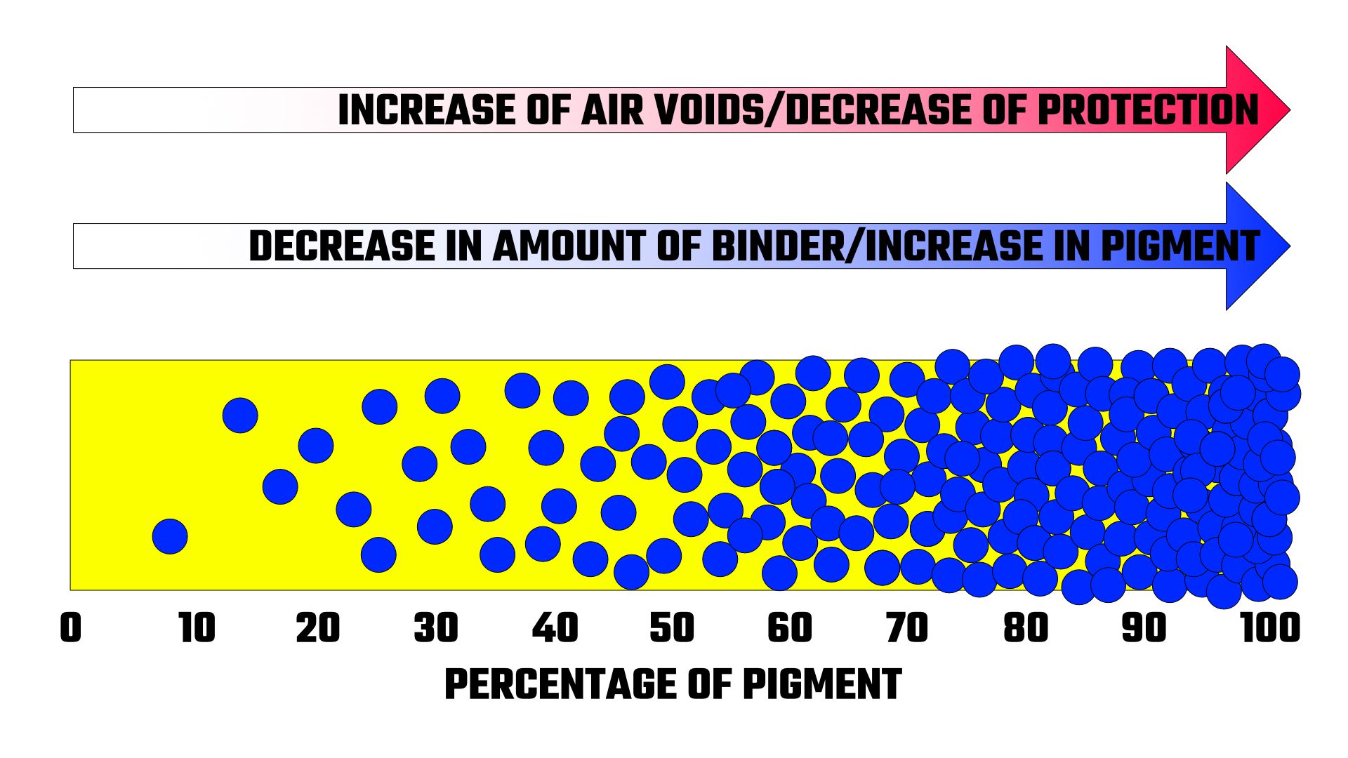
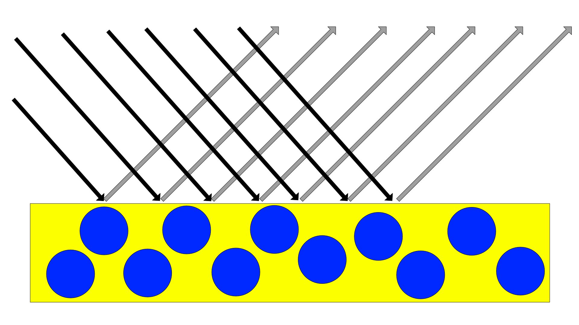
When paint is made at or below its Critical Pigment Volume Concentration, the smoother binder surface scatters less light allowing more light to penetrate and the resulting colours being absorbed and reflected by the pigments. The result of this makes colours feel more saturated and richer as well as appearing more transparent since the difference in RI of a pigment and binder is less than pigment and air. A smoother surface also reflects light away from the observer in a more orderly and controlled a manner. While you may get the the occasional glare or highlight, you will almost never see the scattering effect associated with a surface that is much more matte.
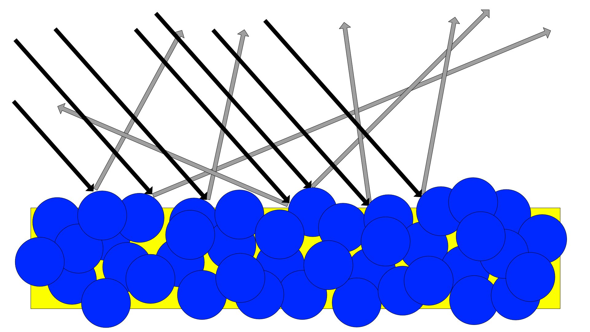
If the CPVC gets higher or is exceeded, usually after about 40%, the paint starts to become more matte and textured. If pushed far enough the pigment ends up only being partly held in place by the binder as there are more air voids than binder, an effect that can be easily seen if you add too much of our Matte+ to a paint range. Once this point has been reached, light is scattered much more, and in conjunction with the rougher surface, becomes much more random resulting in a paint which appears chalky, lighter or washed out, but does appear much more opaque as the light that is bouncing around between the pigments on the surface creates a haze blocking any ability to see the previous layer underneath.
An example across mediums
The best way to explain this phenomenon is by looking at the results you obtain with Acrylics, oils and Casein (milk) paint.
Every year, major paint manufacturers organise and participate in a "Materials Panel" at the College Art Association in the USA. In 2016 the theme was "Pigment in a binder" which looked at the impact binders had on the apperance of pigments. Absolutely no filler pigments were allowed to be used so that the representation of the pigment and binder was as accurate as possible.
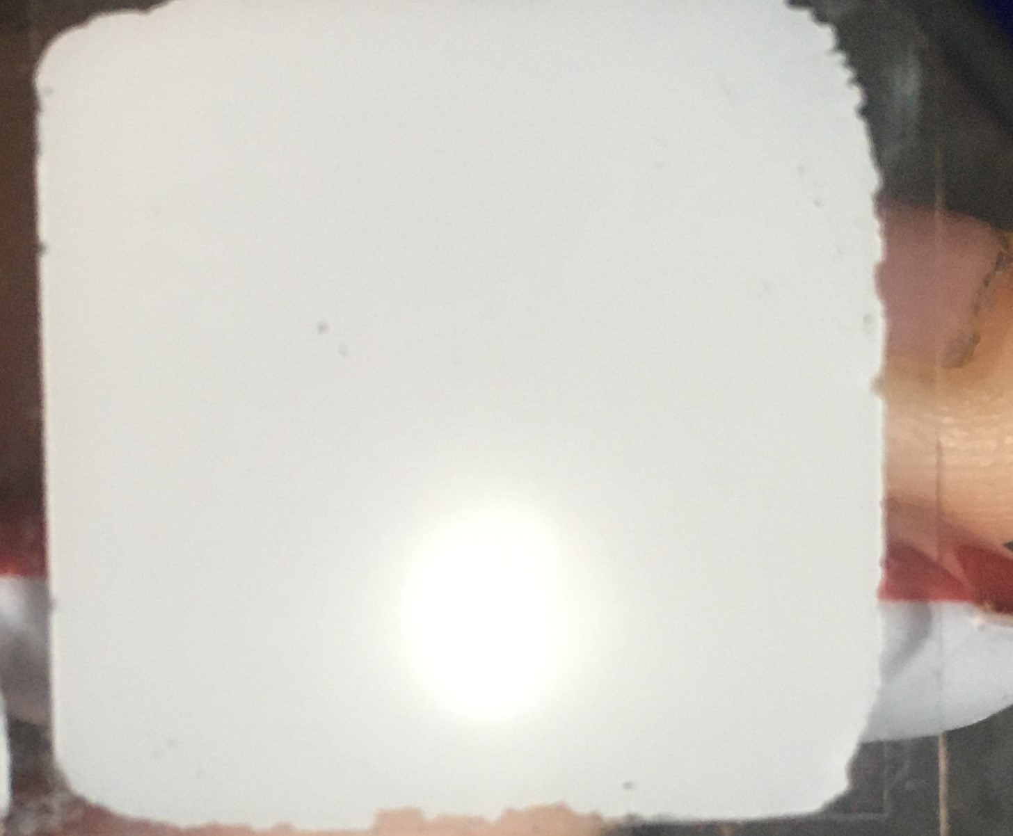
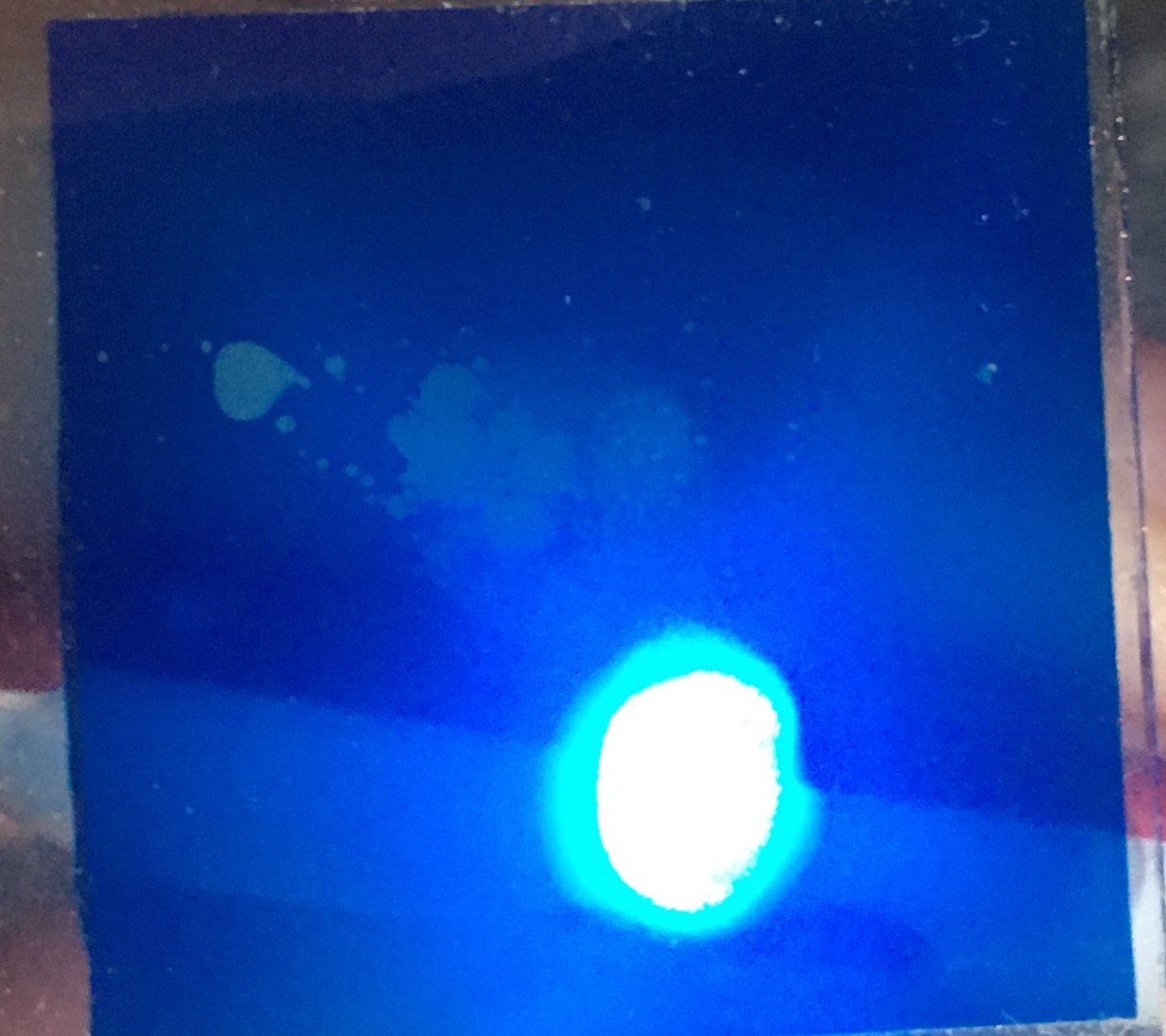
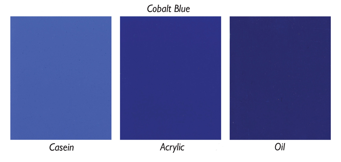
These are the effects produced by Cobalt Blue and Ultramarine Blue in Casein, Acrylic and Oil binders on Black and White drawdown cards at the same thickness.
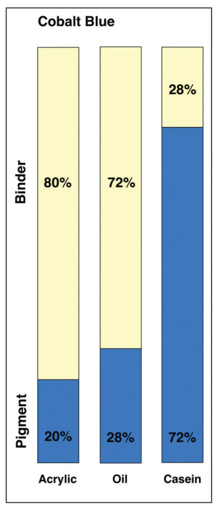
If you take the PVC ratios of the films produced, you get the following chart on the bottom left that shows the relative amounts of pigment to binder. From this perspective, acrylic paint and oil paint do not appear to be overly different, but compared to casein paint, with a rather sizeable 72% pigment load, are pale in comparison. But looking at it from this perspective is a little misleading as it's missing a component that found in both Acrylic and casein paint - Water.
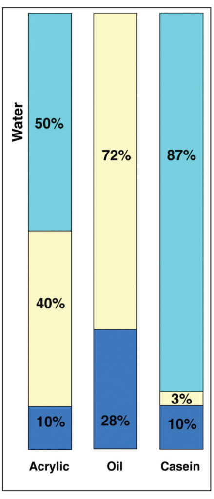
Because water is necessary in these systems, it becomes very difficult for them to match the pigment load of oil paints which is the reason why oil paints are rather unique in the fact that they are very efficient in wetting out pigments and creating a density unlike anything else thanks to the oil molecules being very small.
If you remove the water however, it shows a better representation of the dried films and you can start to see the relationship between pigment and binders and how "Highly pigmented" does not mean a great deal when it comes to Acrylic paints.
As mentioned earlier with Casein paint having a 72% pigment load, this suddenly changes to just 10% with 3% binder. Because of the large amount of water added it produces a much thinner film that is highly opaque and matte, but also extremely brittle meaning it's only suitable for items that will not be touched or moved.
Acrylics increase the flexibility of paints and are by far the most durable and flexible of the three types. The clarity of acrylic binders allows for the Cobolt Blue colour to retain its saturation, but also be protected at the same time by the film meaning that items painted with acrylics, given proper care, can last far into the future with no degredation.
Oils on the other hand have to contend with a binder that will slowly yellow and crack over time, while they give a great depth of colour and are extremly slow drying allowing for some truly seamless blends, the oils that manufacturers have to use need to be chosen carefully. With Blue pigments, this tends to be safflower or poppy oil and these yellow over a far longer period of time, but the trade off is that the film produced is much weaker and brittle.
So if "Highly pigmented" isn't related to colour....
Looking at a paint instead as having a "High Solids Content" might be a better option but should still be taken with a pinch of salt as you'll see in a bit. In theory, the higher the amount of solid "pigment", the more coverage it should have but also the less hard wearing and chalky it will be. This means that paints with a "High Solid Content" will need thinning out much more to disperse the pigment better into the film once the water has evaporated.
This is why multiple thin layers of paint are better than thicker layers. If you think of thinned paint like the Casein paint example as shown earlier, you can get more pigment down on a miniature at a cost of the amount of binder being applied. But this means that thin layers of paint are incredible fragile, like a Casein paint, and if the amount of binder being applied is too little with each subsequent application, results in a chalky effect as the CPVC is being pushed too far. A typical reaction with paints that utilise large particulate "pigments" that create coverage.
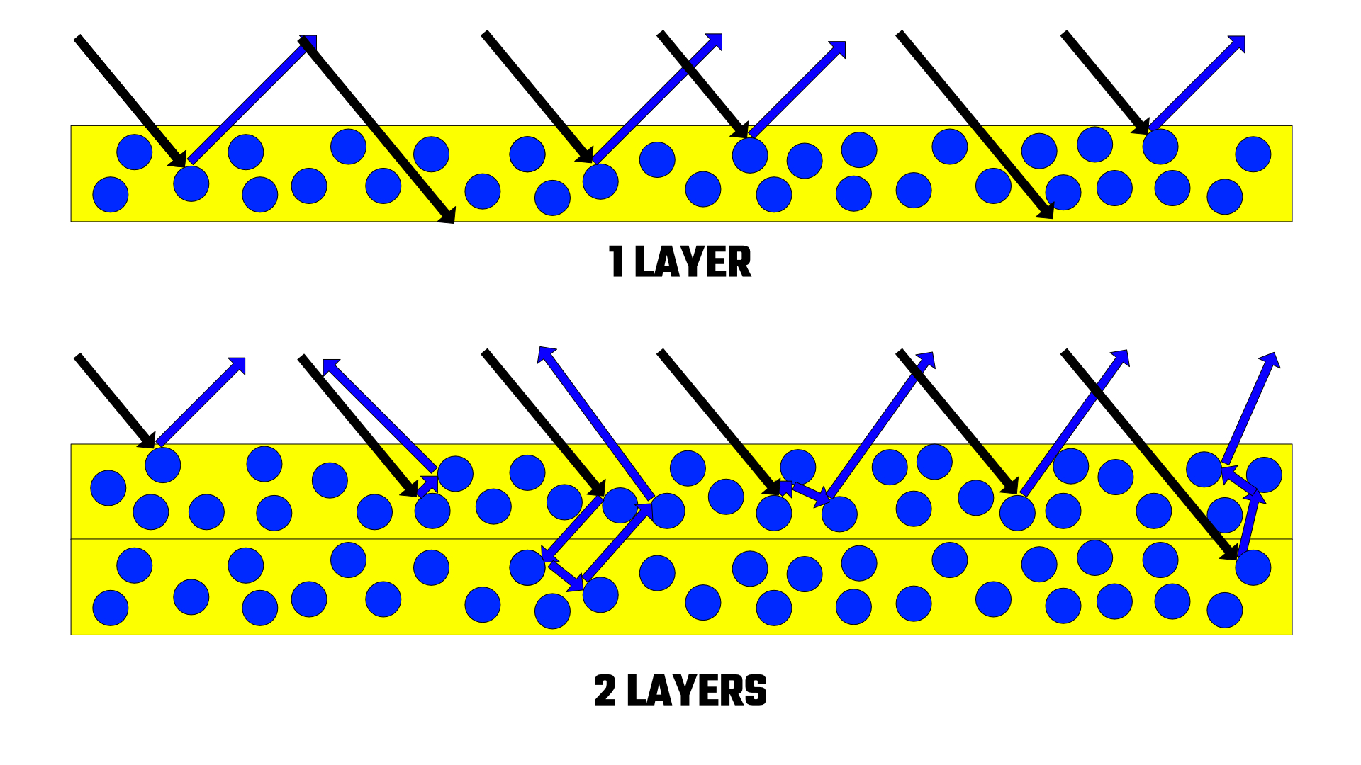
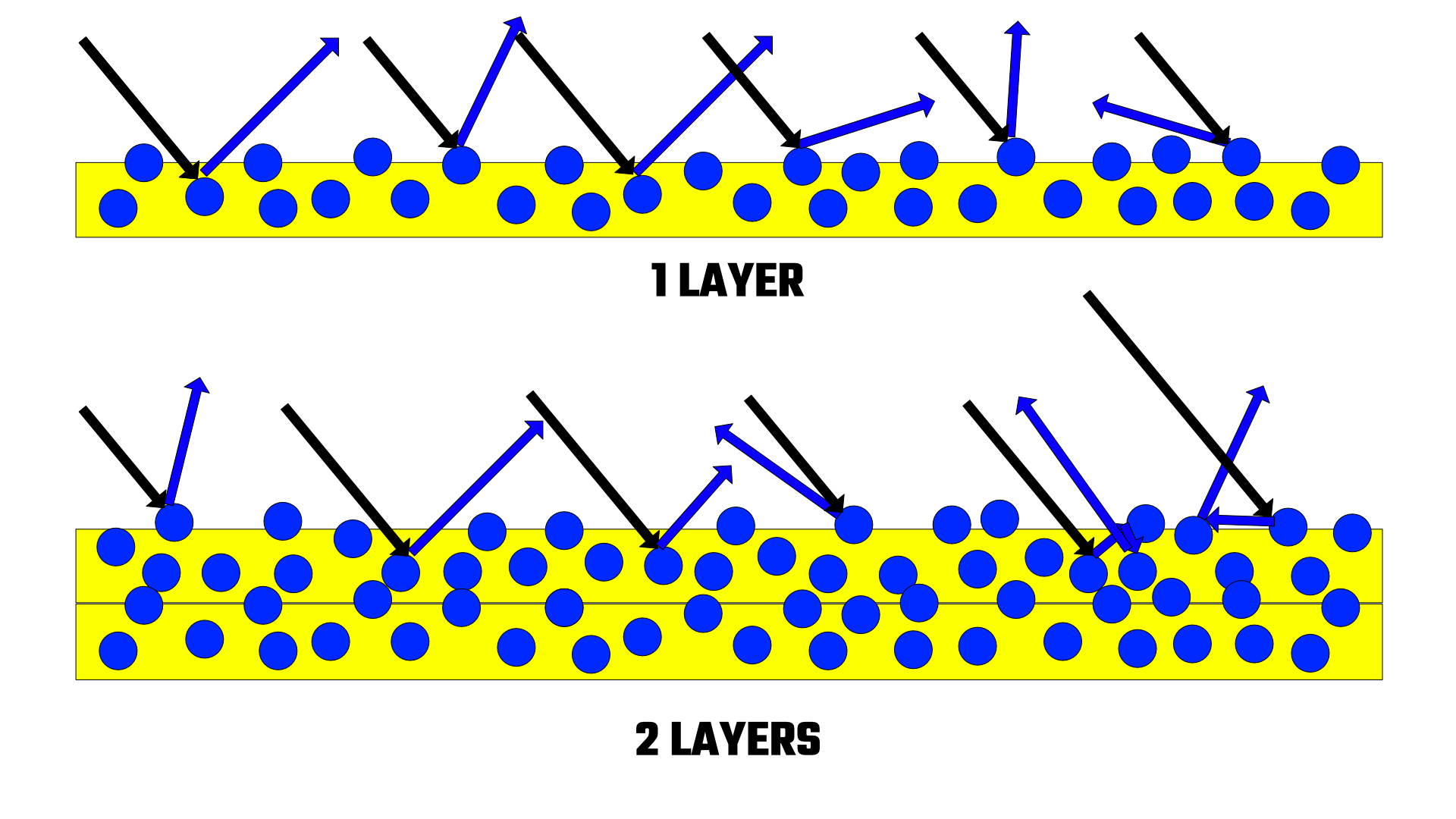
The solid content doesn't just relate to pigments though, there is also the acrylic in the paint to consider as well. It's still a particulate and could easily be considered a "pigment" in that regard. The more acrylic, the thicker the binder, the higher the pigment load. However, in the case of our Alpha line, the binder we use has a unique property allowing us to create a paint that can replicate a higher pigment load while using less "pigment".
We took several brands of paint, including our own and determined the solids content of each one as an average.
Citadel Base - 65.7% Solids
Citadel Layer - 59.6% Solids
AK 3rd Gen - 62% Solids
Scale75 - 58.3% Solids
Vallejo Game Colour - 63.7% Solids
INSTAR Alpha - 45% Solids
INSTAR Paint - 60.5% Solids
Army Painter - 38% Solids
The results here may surprise you a bit, notably with Scale75 as it is considered one of the best covering paints in the industry....but surely Citadel Base paints should be far better if the solid content is higher?
The simple explanation for this is that it is all down to the raw ingredients that are used to make the paint with. All manufacturers make their paints using different materials and no single paint is ever made the same way. Scale75 or their manufacturer clearly use a different type of "Filler" pigment in their process compared to Citadel resulting in a very matte finish while allowing for more water to be added into the system. However, Scale75 is also very difficult to thin out meaning that the filler could be a very fine, dense particulate compared to what Citadel use which would explain why there's less in the bottle, but gives more coverage.
But you'll see the Alpha Range contains far less solids than all the other ranges, yet has a level of coverage straight out of the bottle that's comparable to the other brands when thinned with mediums. Again it comes down to the ingredients used and the nature of what we use to make the paints with. By using some clever methods we're able to create fully saturated colours while keeping the viscosity of the paint very fluid allowing for thinner layers to be built up without any further thinning being needed.
Conclusion
Getting hung up on pigment content is something no painter should really be doing. As we've found with this article, its a rather complex world with the word "Pigment" not really meaning much at all, Even the term "Highly Pigmented" doesn't really mean anything either. What should be taken away from this is that each paint brand has its own, unique, personality that has nothing to do with how much pigment it contains, but more to do with how it's produced. This means that each brand has its strengths and weaknesses and this also changes from colour to colour. Our Alpha line is no exception with Pure Mid Yellow being a very transparent Yellow compared to Pure Yellow. Learning what these differences are is what makes you a better painter as you can pick and choose certain ranges to do different jobs or in the case of our range, learn how to manipulate the Alpha and Provectus ranges to create the paint you need at that specific point.
The whole point of our Alpha and Provectus range was to allow the painter to have full control over the paint style and finish. Instead of having multiple ranges and hundreds of paints, the Alpha and Provectus ranges combined can help you create the style you're looking for in an easy to create manner. This is why the Alpha range has a much lower solids content than other paints and serves as a good base layer for a painter. By itself the Alpha range is a very powerful paint in its own right and can stand proudly by itself with the big boys, but if a slightly different finish is required, it's easily adaptable and something that's not offered by other brands.
However, if you want to try and find out what "pigments" a brand uses, you'll very quickly hit a brick wall. With some very few exceptions (INSTAR and Warcolours being the notable ones) for example, almost none of the major brands or new, upcoming brands, actually make the paints themselves, but use a larger manufacturer to produce their paints meaning they will not know what has actually been put into the paint, nor what pigments have been used.
In the case of colour pigments, some brands may not even be able to tell you what pigment has actually been used as some colour pigment manufacturers use "Blends" which are a combination of raw pigments in an unspecified amount. However, from late 2021, we at INSTAR, will begin to add pigment codes to our bottles when production allows and the product pages for clarity of the pigment codes we use.
In both regards though, no brand or manufacturer would ever tell you what ingredients go into their paint as it's all kept rather secret. To this end it's the single reason why colour matching is never 100% perfect. Unless you knew exactly what ingredients, pigments and manufacturers another brand used, you'll never get a 100% match, the closest you could ever get would be 99.5%. This is why when a DeltaE distance calculation is used to compare any two colours, A DeltaE (or dE) of less than 1 is deemed as imperceptible to the human eye.